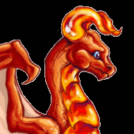
Posted January 3, 2012 (edited) The merge made the other thread kind of confusing, so we are starting a new thread. Note: this thread is not about arguing whether or not the changes should have happened and nor is it a place to brainstorm on how to get them removed/changed. It is for your thoughts on the sprites. Everyone is allowed an opinion. If you're interested, Old Gold Decoration: http://forums.dragcave.net/index.php?showtopic=129906 And for those interested, throw in your opinion on a vine update: http://forums.dragcave.net/index.php?showtopic=130033 Here are all the changes, side by side, for ease of seeing. Golds: -> Horse: -> Sunsets: -> -> Sunrise: -> Edited January 5, 2012 by SockPuppet Strangler Share this post Link to post
Posted January 3, 2012 (edited) Lol I was wondering when somebody would merge all of these. Love the updates~ EDIT: And wow look, first post. =P Edited January 3, 2012 by Verridith Share this post Link to post
Posted January 3, 2012 Repost: I most definitely enjoy the new golds. I had no idea they had changed until earlier tonight, when I was out to breed my tinsel. I saw the females on the breed list and stared, open jawed. I was so overjoyed that they were finally implemented! I do have a hazy ( no pun intended ;D ) memory of when they were first being created. I believe the fact that the new golds had been sprited out in the open, with crit from the (then current) public (with over 1000 votes to boot) is enough to show that the revamp was a favorable one for most players. I'm sorry that some players don't like the revamp. I've played on DC since 2008, been on the forums a year later. I worked hard to get my first gold and silvers, and I was elated. I liked the sprites at that time because I thought they were pretty. As I've come to understand more about spriting and the beauty that can come of proper definition and anatomy, I do favor dragons with this correct traits more. I still love the older-style gold, but this one puts the dragons in a new light that makes me "ooh" and "ahh" over them. Sure, I understand not all players will see them this way. But I'm definitely certain this change was for the best. Besides, I really couldn't see how the old sprite could have been updated. Too much was wrong with it, unfortunately. But still. I don't put the value of the dragon in what it looks like. My dragons are special because of what I make them to be, not because of what they look like on my scroll. Improvements in their appearance only helps to spur my imagination in developing their character. That's why I don't see how these dragons' aren't the same. It's the same breed and the same features, just in a better light. Anyway. Much love for these golds. I would like to shoot Nakase a PM outlining some constructive crit I have, but I don't think she'd like that |D My main concerns (though this doesn't make me like the sprite any less, I still adore it beyond belief) lie with the lack of the golden glow. The lack of the belly scales are alright with me, for all I know they could have been there originally but were voted out. *shrug* Seems like that'd be kind of hard to miss. Nakase, I love you and your beautiful, stunning artwork. c: Please do continue showering us with your excellence. <3 Share this post Link to post
Posted January 3, 2012 I love the new golds, in particular the adults. I do admit that I loved the derpyness of the original gold hatchies, but I had an aversion to the original adult sprites (which I kept hidden at the bottom of my scroll, in the hopes that one day their sprite would be updated ). I think I must collect some horses. The bluish tint and updated anatomy, as well as the flare of the manes are most impressive. Of the sunsets, I am neutral over the female, as I don't see the updating as detracting or improving the beauty of the sprite in anyway. The original was already beautiful. I love the shininess and increased contrast of the male, but likewise I don't really see the update as improving or detracting from the original sprite. I feel that for the sunrise, the increased contrast from the shading definitely creates the fabric feeling that the artist was intending. Share this post Link to post
Posted January 3, 2012 (edited) First of all, not that I particularly dislike the old sprite, I absolutely love the updated Golds. I am sorry to see though that there are still some users who aren't exactly ecstatic about the change. I am not disparaging their opinions, I just wish it were possible to please everyone. Unfortunately, that just doesn't seem to be very often possible... As far as the other sprites go, I love the updates on all of them! My only issue, if it must be called that, is with the Sunset Male. To me, the eyes seem to be somewhat off. I am not exactly sure why, though it does seem they have been enlarged? Its not much of a problem, I still really love the dragon. ^^ Again, overall, thank you for the wonderful updates! Edited January 3, 2012 by Daciana_Adena Share this post Link to post
Posted January 3, 2012 Loving all the changes. Golds are epic, making linages look so much better. Horses, I don't have any, but from here the update looks good. I can barely see it on Sunrises and Female Sunsets, but the Male Sunset looks so much better. Share this post Link to post
Posted January 3, 2012 Love the new golds! I'm so glad I finally picked up a couple recently... I've been avoiding them for years because I didn't like their look, and now they look fabulous! Also love the new horses. They look spectacular, I'm going to enjoy collecting more of them. The sunrise/sunsets... I can see the changes when they're side-by-side, but it's not enough of a change for me to really notice when I see them on their own. I'm still meh about them. The updates look better, IMO, but I'm still meh about the breed in general. Now off to look at the vine update thread! Share this post Link to post
Posted January 3, 2012 WOW! I am loving the updated sprites! YAY! This just made me love my one and only gold SO MUCH MORE! (Is go glad she's a female too. <3 the sprite!) The horses are much better too! I was wondering why I was having a hard time finding them. <3 The sunsets took me a while to notice the difference but they too look amazing. Thanks everybody! <3 Share this post Link to post
Posted January 3, 2012 Now over the initial shock of the change, I am really liking the pose and new sprite of the Gold, it is really well done. The others look good too and great to see how they have developed side by side. I think for some like me it is nostalgia that can get in the way initially and then you realise what new wonderful thing there is ! Share this post Link to post
Posted January 3, 2012 (edited) Simply looking at the golds on people's scrolls I must admit that they are lovely. The old sprites were awesome but outdated, and these do blend better with the newer dragons. However looking at them in lineage pages they're not as distinctive... my eyes were always drawn to golds in lineages, even long and messy ones, because their coloring stood out. The coloring and shading of these sprites makes them blend too much with the tinsels, and they don't seem to pop out in a lineage like they used to. I still think they're beautiful, but just that one aspect bothers me. Edited January 3, 2012 by Trinity. Share this post Link to post
Posted January 3, 2012 I really, really love the updated horses and the male sunsets! ^^ And the darker colours on the female sunsets match the males better now Share this post Link to post
Posted January 3, 2012 I love all the new sprite updates. The new gold sprites are gorgeous, and I have the urge to hoard them now. I was also very excited about the sunset and horse tweaks - I feel like the sprites really live up to their potential now. Share this post Link to post
Posted January 3, 2012 (edited) Love all of them, though the golds do feel different from before. Like I said in the previous thread, I may be jaded to sprite updates since this is the second time the gold has changed (the first being The Fog) and I was here for both. Part of me is sad that Swift no longer balances my eggs on his head, but that's okay. And thanks for the link, Sock. Now no one has an excuse not to vote on that vine poll. Go vote. Govotegovotegovote. Edited January 3, 2012 by Lythiaren Share this post Link to post
Posted January 3, 2012 I just hope with everyone commenting on how dated the gold sprites are, that other sprites done in similar styles won't be wiped from the site. I like a good variety of art techniques. It also seems like this would kill the attempts to get some more eastern dragons in. That would be a real shame. /repeat disclaimer: yes the new sprites are nice, the old ones were not bad. And I understand you want sprite chatter here, but I know I didn't comment in the old gold poll because I assumed it was a lost cause due to how old it was. Obviously, wrong there. So I don't want to give the impression that 100% of everyone here simply must have the same art style of dragon by not saying that I was happy with the previous one. Here's a page with some heraldic dragons, for those that aren't familiar with the style. Heraldics Also, as it was brought up before the old thread got closed. One reason the pinks were done as they were, several of us mentioned that we had named our obnoxiously glowing pinks based on that color. And renaming was not an option at the time. So, if the sprites had been changed, we'd have been stuck with names that no longer fit the dragons to which they were attached. Share this post Link to post
Posted January 3, 2012 Lols, was wondering whether a merge topic was in order. =P I like the new gold sprites, though I admit it's been unusual seeing them now. I'll get used to it though. ^^ I think it's just a matter of getting accustomed to the shade of their scales. The poses are lovely, I think, and suits the regal vibe the golds give off. Considering how they actually make me want golds, I count that as a success. The horses definitely look better now with their updated shading - can't fault that. I'm so-so on the open mouth, leaning more towards the 'closed was better' side but it doesn't really bother me enough to complain. I also liked the colour improvements to the male and female sunset sprites. Happy to see that the male and female sprites 'match' each other now. Tres curious about the plans for the vine dragon! Going to have a look at that thread. Share this post Link to post
Posted January 3, 2012 I've seriously posted enough about my opinion on the Sunset males-- tired of typing it as I'm sure people are tired of reading it. But just so no one can accuse this post of being all 'criticism' and no 'constructive': overly shiny and have lost the dark, rich color contrast they had before. While considered flat to some, the old sprite really popped out for me and the anatomical and shading flaws were not so terrible that it detracted from my liking for it. The current shading style appears pseudo-realistic to me, and I guess I prefer more flat shading (even if it didn't match the female). I'll sorely miss the original. Neutral on the Golds since I never really had an opportunity to enjoy the original sprite. Only one of my dragons was changed, so I can kind of understand how those with a bajillion Golds may have stronger opinions =p Horses are cool, I like the coloring of the mane and tail. I see some shininess on it... though in this circumstance it looks fine. Share this post Link to post
Posted January 3, 2012 I've seriously posted enough about my opinion on the Sunset males-- tired of typing it as I'm sure people are tired of reading it. But just so no one can accuse this post of being all 'criticism' and no 'constructive': overly shiny and have lost the dark, rich color contrast they had before. While considered flat to some, the old sprite really popped out for me and the anatomical and shading flaws were not so terrible that it detracted from my liking for it. The current shading style appears pseudo-realistic to me, and I guess I prefer more flat shading (even if it didn't match the female). I'll sorely miss the original. Oh thank god, I wondered if it was only me. >__>; The sunset dragon used to be one of my top favourites, now it's just... "oh. Another dragon. OK." Will be having to move its placement on my scroll. *sigh* While I adored the old gold dragon, I love the new one. But I love them for different reasons. I'm ok with the other updates. Share this post Link to post
Posted January 3, 2012 They're purrrrrrty. I know some people have pointed out that the male is in a sort of generic pose, but I actually like that -- I mean, he's the GOLD dragon -- if ANY dragon gets to stand in striking profile, he does? He carries his head much higher and more reared back than the other dragons in this pose, I think. And it's nice how that preserves the profile angle of the original. The evenness of his head with his chest makes for a nice tile in lineages, too. And the female pose is nice and dynamic. Love the head and neck angle on her. The shading, especially on the wing membranes, is bEaUtiful. WARNING: a bit of critique follows, maybe just don't read it if you aren't in the mood, okay? I LIKE the sprites and am not "bashing" them, there are just things about them that still bother my eye enough that I'm not crazy wild about them... in fact, I'm going to put this in white, so that people needn't even see it if they care not to. Having stared at them a LOT for the past day, I feel like there are certain aspects of their anatomy that are a bit off (though this is not to say that they aren't beautiful -- they are lovely, and executed with loads of skill). The wings on the female seem like they're much, much too small, as if they should be 2-3 times the size they are now. On the original sprite, and on the new male, the outer aspect of the wing is about 1 1/2 times the length of the torso, while on the female the outer aspect of the wings is smaller than the torso. I'm not sure why the wings are so small, or the membrane so "pinched" close to the torso, but in this position, I don't think we'd see that front foot around the vast spread of wings unless it were extended forwards, near the neck. When I look at the female, each time it strikes me as young, with still-growing wings that couldn't support it in flight yet. Also, her shoulder spikes are projecting at two different angles, as if the one on the left has been bent down and flattened. From this perspective, I think they should both be projecting at more or less the same angle, though with the one on the left drawn slightly straighter than the one on the right, and the right one should be brought back a little closer to center. On another wing note, I realize that the original Gold didn't have an elbow-side membrane on the wing, but it looks strange to me that these dragons don't have even a taut, slight hint of one. There are also several things that don't seem to match between the male and female sprites -- not that they don't look all right in their own regard. The shoulder spikes on the male are significantly smaller than those on the female, and also seem to project at a different angle and have a different shape. It seems as if they should perhaps lean back a little farther, and be a little longer. I can't quite tell if the darker shape is the second shoulder spike, or the arm of the back wing. If it's the spike, then the same thing is going on here as with the female: the spikes aren't at the same angle as one another. Plus, this means that on the female, the neck-spikes are splayed widely apart, while on the male they're more centered. The neck ridges on the female are much larger and more defined than those on the male, where they seem to quickly meld into the line of his back. Their necks almost seem to be different lengths, because the male's neck can only fit 3 or 4 ridges while the female's has about 7. The female's head also seems a bit too small (just a *bit,* by maybe one pixel all around); it's okay for it to be smaller/slimmer than the male's, but the difference is strong enough that, coupled with the different neck lengths, they don't quite seem to be sharing the same anatomical/skeletal structure. The male's head horns look like they are a relatively even width along their length, and curve slightly forward at the tips, while the female's look as if they are conical, and lack that hint of curve. The male's wing-finger knuckles are huge and knobby, while on the female, we can't even see the knuckles. I think they'd look okay if they were toned back just a little bit; like this, they're so large that they seem almost arthritic, poor dragon! Due to all of that going on, I don't *love* the sprites, though I do *like* them quite a bit. I really, really like the style they're drawn in, love the excellent shading and sense of life and movement, and the proud, strong poses. I do miss the lighter shade of gold and the 'shining' effect; they look very different in lineages than they used to, and it makes me wish that the color effect had been preserved, so that they would really pop instead of kind of blending in next to the Gold Tinsels. But, next to other dragons, they do shine, and catch the eye. I'd almost like to see the female's lineage tile "zoomed in" a bit, so that she could fill more of her space the way the male does so nicely! Ooooh, also, I really like the muscles on the limbs; they're well defined and definitely make the male look like a force to be reckoned with. Share this post Link to post
Posted January 3, 2012 I love the new Gold sprites. Now it is really golden not just a kind of yellow. The new eggs looks much more golden now but they can easily been mistaken as a gold tinsel now. And I also like the new Horse sprite though I have to admit I would love to see it in it festive colours again. And for the Suns: I didn't even realise they changed. Share this post Link to post
Posted January 3, 2012 I love them all. At first when I saw the new gold sprites, I was a little surprised by how different they were from the originals and I think that skewed my opinion a little, since I was used to the originals and it was such a big change from that. But looking at them now, I realise that I really do love the sprites themselves. They're well made and look great. So while I think it's going to take everyone a little bit of time to get used to them, I'm excited about it, because they're fantastic sprites. The horse looks practically the same as it did before, same colour, same stance, same everything... but the upgrades to it make it so much better. That's the kind of upgrade that I'd really like to see on a number of sprites - something that doesn't affect the overall feel and look of the sprite, but just touches up some of the issues to improve it. I really love the new horse sprite and I'm super excited about it. And the sunsets/sunrises look great too. Shiny, shiny~ Share this post Link to post
Posted January 3, 2012 Such a cutie, I'm so tempted to freeze. Must.. resist..! I'm gonna miss the original gold hachie's attentive little sprite Absolutely love the female gold in every way. The male gold's pose looks stoic in a hieroglyphic way though The original gold still looks far better in a lineage tile, while for the new gold the effect is much more subdued, in fact the male gold does resemble the harvest in a way Share this post Link to post
Posted January 3, 2012 I love the updated Horse - it's a great change. Subtle enough so as to keep the original sprite, but with enough change to really make it stand out, without being jarring. I also love the Sunsets (in particular the male). I really like how the wings now seem to shimmer as if he is flying through a beautiful sunset and getting the colours reflected off him. I love sunsets (and we get some beautiful ones in the area in which I live, and I can really picture the Sunset dragon amidst the glory of it. I keep staring at the Sunrise females and honestly can't see a difference - I'm sure that's just me. However, sadly whilst I love the Gold hatchies (and I really love them, I wish Golds bred more easily so I could complete my collection of them), I am not a fan of the adult dragons. There is no doubt a huge amount of work has gone into creating them and as new dragons they are really interesting and stunning. But I personally don't really care for them. The male looks too much like the Harvest to my eye and I can't figure the female pose out. And somehow the colour doesn't seem as gold as the old Gold. To me they seem more like brass or bronze and seem flatter somehow - they have lost the element of being majestic. The new Golds have no resemblance to the original ones - unlike the Horses and Sunsets which have just been 'tweaked', the Golds are completely new. They are not bad dragons, not at all - far from it. They are excellent dragons; they just don't appeal that much to me. Having said that I'm not a huge fan of change, certainly major change, so maybe in a few weeks they will have grown on me. Maybe it is still just the shock of them being a totally different dragon from the original Gold. But like all art, like anything creative be it a painting, a drawing, a sprite, a piece of pottery, a story, etc. etc. etc. etc. it is down to personal choice. I can admire Charles Dickens as a writer, I know he's a fine writer and wrote some first-rate stories, but I personally (with the exception of A Christmas Carol) don't like his work. The same is true with artists and spriters: one can admire their work, know and respect the skill that has gone into it, but that doesn't mean you have to actually like it. And that is how I feel about the Gold dragons; I know how much work has gone into it. I respect the spriter and their skill and talent in creating something that is really good - but I don't really like it. Share this post Link to post
Posted January 3, 2012 (edited) Maybe it's just because I don't have any effort invested into the old golds, (I never liked the sprite, it was simply the rarity making them valuable to me.) but the new sprites are a massive improvement. Definitely makes me regret my decision to avoid golds! Like Kelkelen mentioned, if any dragon deserves to use a "generic pose", it's the male gold dragon. That does make the male vaguely similar to the harvest dragon, but he is much more majestic. I think that's fine overall. The harvest dragon isn't using that pose--the similarities come from the coloring and the perspective. The updated color scheme is much more true to what gold is supposed to look like. Before this they were only yellow! I imagine I would be upset if I had planned lineages around having a yellow dragon stick out--but that's somewhat unfair to go by. A solid yellow dragon would never make it into the cave these days. I looove the horse update, but I'm disappointed seeing the male sunset. The flat shading was great for showing contrasts. It will grow on me, but they were one of my favorite styled dragons previously. I am very happy to see some love on our older sprites, regardless! This is a really exciting development that I'm hoping we see more of in the recent future. C: Edited January 3, 2012 by shmeepie Share this post Link to post
Posted January 3, 2012 I really love the gold updates. I like the horse updates, too, but I also wish we could have picked one to keep in holiday costume! The sunrises and sunsets I have to look at closely to see the difference - this is why I'm not an artist. Everything looks great, though! Share this post Link to post
Posted January 3, 2012 I never actually got the love over the old gold sprite and I just collected them for rarity's sake. Them and the regular black sprite but thats a different story. The more I look at the gold sprite, the more I love it and I definetly have to freeze a hatchling of them now, too adorable. I actually gave my CB gold a description the other day after so many years and very few of my dragons have descriptions. The sunrise/sunset change is very minor to me so I'm nuetral on it...still am not fond of the male sprite, its in like a totally different style to the female which creates a bad contrast in my mind. I'd like for them to have matching styles one way or the other but I definetly prefer the female sunset style still over the male. Liking the horse change. Much better shading and the pose tweaks are subtle and yet substancial enough to give it the same horse feel with a much more dynamic energy. Now if someone could just tweak the shield dragon so that I actually want it on my scroll... Share this post Link to post
Recommended Posts